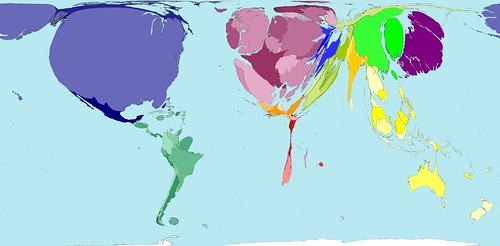
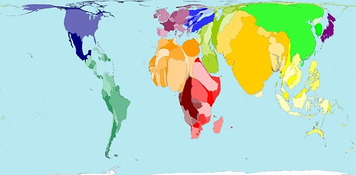
[Image: The world mapped according to number of aircraft passengers].
New Scientist calls our attention to the wonderful world of warped cartography, courtesy of Worldmapper, based at the University of Sheffield, UK. Created by Danny Dorling and Anna Barford, Worldmapper's maps transform traditional cartographic projections using unexpected statistical guidelines: the world according to machine exports, car imports, working tractors, dairy exports, aircraft departures, children in the workforce, population in 2300 AD – etc. etc. Worldmapper's goal is to release 365 different maps throughout the upcoming year.
Some particularly eye-popping examples appear here...
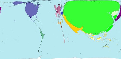
[Image: The world mapped according to number of container ports (!)].
[Image: The world mapped according to refugee origin].
[Image: The world mapped according to net immigration – apparently no one's moving to India].
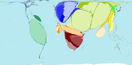
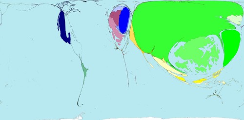
[Image: The world mapped according to expected human population in 2300 AD – look at Australia].

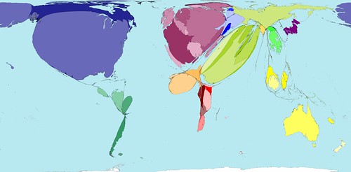
[Image: This is the world mapped according to toy exports and toy imports, respectively].
More – and more and more – of these maps can be found at Worldmapper. While you're at it, check out these beautifully executed globes by Ingo Günther's World Processor...
No comments:
Post a Comment