architecture

Friday, February 29, 2008

Take the High Road: Paris

Recently, I have run into a couple of references to a project in Paris that seems the predecessor of The High Line project in New York City. 'La Coulee Verte' (aka The Flowing Green) is a partially elevated railroad route through that was abandonded in 1969, and given to the City of Paris. Also called the Promenade Plantee, and The Bastille Viaduct, the project was designed by architect Philippe Mathieux and the landscape architect Jacques Vergely, how worked collaboratively on the realization of the project, which was completed in 1995.


:: La Coulee Verte - image via Eco Partners

The similarities to the High Line are significant and an interesting precedent to elevated landscape projects. Using these abandoned remnants makes sense for a number of reasons. First, the space are typically underutilized, and often blighted. These spaces are also typically visible from adjacent buildings, which makes greening a visual imperative as well. The linear corridors, often with minimal disruptions from cross traffic, allow for linear greenspaces, as well as providing activation at the ground levels, providing some potential catalytic development.


:: The High Line - image via Architect's Newspaper

There is obviously more current information on the High Line, and I have yet to really dig deep into the competition, design, and subsequent installations, which I will investigate in a later post. For now, I am looking at The Promenade Plantee as a vital precedent to vegetated architecture. The integration of space, along with the implementation of park like features similar to rooftop gardens, with planters, structures, and water features. This is due in part to the significant structure predicated on the previous use, as well as the width, allowing for pathways as well as adjacent nodes and public spaces.

A number of these elements appear in photos of The Promenade Plantee, covered in a selected number US and French sites, including the unofficial site with numerous photos. The 2.5 mile elevated corridor is punctuated with spaces to relax and pause, while connecting to various parts of Paris, from the Bastille Opera House to the Bois de Vincennes.


:: La Coulee Verte - image via Webshots - gerard_de_f


:: images via Friends of the High Line

The linear corridor is only part of the system, with exciting interactions of spaces happening either below, or at significant crossings. A major park crossing occurs at Jardin de Reuilly, with a bisecting elevated walkway:


:: images via Friends of the High Line


:: images via ARDDS

An example of the activation of adjacent districts is the Viaduc des Artes. A restored viaduct that features arts and crafts studios as well as an assortment of cafes and restaurants that has become a community gathering space. It must have a coffee shop or two, as it even makes the cut as one of PPS Great Public Spaces.


:: Viaduc des Artes - image via ARDDS

The influence the Promenade Plantee has on The High Line is significant, and it will be interesting to see the similarities and differences. Obviously there are stylistic differences, but as a whole are the two projects getting at the same goals - revitalization, activation and redevelopment to provide energy to adjacent neighborhoods while offering a linear green corridor. The project(s) have also spawned some significant projects like the Beltline in Atlanta, the Reading Viaduct in Philadelphia, and the Bloomingdale Trail in Chicago.

This trend definitely takes rails-to-trails to a definite new level...

The Subterranean Water Cannons of Leadville, Colorado

There was a fascinating article in the New York Times yesterday about a mine disaster just waiting to happen.

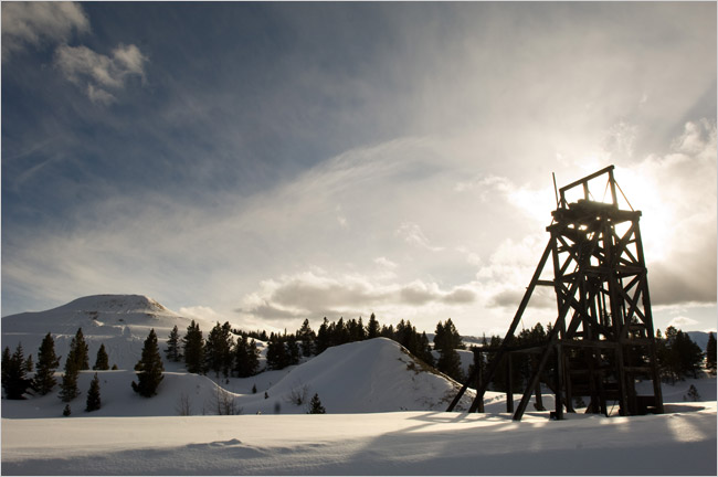
[Image: "Abandoned equipment stands in the snow near the top of an underground tunnel that was once used to drain mine water." Photo by Kevin Moloney for The New York Times].

In Leadville, Colorado, we read, people now wake up every morning wondering if they "will be washed away by toxic water that local officials fear could burst from a decaying mine tunnel" on the edge of town.
    For years, the federal Bureau of Reclamation and the Environmental Protection Agency have bickered over what to do about the aging tunnel, which stretches 2.1 miles and has become dammed by debris. The debris is holding back more than a billion gallons of water, much of it tainted with toxic levels of cadmium, zinc and manganese.
The article continues, describing the background for this "potentially catastrophic release of water":
    Abandoned mine shafts honeycomb the surrounding hillsides. The old drainage tunnel, built by the federal government in 1943 to drain hundreds of these shafts, began falling apart in the 1970s, causing water to pool. In 2005, the E.P.A. offered to start pumping the clogged water toward a Bureau of Reclamation plant, which treats the water flowing through the tunnel; but the bureau contended that the additional water was part of the E.P.A.’s Superfund cleanup responsibility.
And so nothing was done. The threat of "release" is now so great that property in the town can no longer be insured.
One wonders if it might be possible to build something like this deliberately, as a military tactic: a kind of long-delay, underground water cannon that only fires once, several decades after construction.
You leave a few dozen of these things lying around, beneath a terrain you have to evacuate... and so whenever your enemies move in, they've got some rather big problems beneath their feet.

Thursday, February 28, 2008

Green Ribbon Design: Heping Park

Here is really compelling project by Perkins+Will for the Heping Park in Tianjin, China, provides elevated ribbons of vegetation defining the roof zones.


:: image via Perkins+Will

Covered in World Architecture Network, the project description is punctuated by 3 large towers, as well as parking and green spaces creating a vegetated canopy that is engaging from street level as well as from above. Daylighting is allowed through circular penetrations in the roof plane:


:: image via WAN

From WAN: "The neighborhood's redevelopment plan includes new high-rise residential construction that will emphasize a higher quality of life through the integration of public green spaces and parklands... The ample green space was achieved by submerging two garage levels below the main park that begins at grade at the west end of the site. Ribbons of green space undulate across the site, admitting light, access and ventilation to the parking below. The green ribbons rise to form a green roof over the three pavilions that form the community center at the eastern end of the site... Various grass textures accentuate the patterns formed by the folds in the park. A variety of paths provide access through the site, emphasizing the pedestrian network at grade."


:: images via WAN
The concept diagrams remind of the vocabulary used in the Olympic Sculpture Park in Seattle (with the zig-zag form of pedestrian circulation) specifically when seen in the diagrams below. It is unclear how interactive these vegetated spaces will be, as well as the nature of vegetation:

:: images via WAN
The form is interesting, providing a way of articulating a horizontal plane with artificial topography, allowing for building forms to occupy the folds. Hope to see more in the future.

Tagging

Not an urban graffiti post, but a virtual tag from The Where, via Pruned, via Passages and on, and on... some of my favorite blogs, so sure, I can play along:

:: The rules of the tagging game are as follows:
1. Pick up the nearest book (of at least 123 pages).
2. Open the book to page 123.
3. Find the fifth sentence.
4. Post the next three sentences.
5. Tag five people.

The book is a good one, Building for Life: Designing and Understanding the Human-Nature Connection, by Stephen R. Kellert. I've been picking away at it for a week or so, and had not made it to p. 123.


:: image via Stout Books

Page 123 opens the fascinating chapter on Biophilic Design...
"Reducing the adverse effects of modern development is arguably the first and more basic priority of restorative environmental design, but we must go beyond this limited objective to also identify how buildings and landscapes can foster human lives of meaning and satisfaction by celebrating our dependence on nature as an irreplaceable core of intellectual creativity and emotional capacity. The label 'positive environmental impact' or, preferably, 'biophilic' design describes this second dimension of a comprehensive approach to restorative environmental design. The fundamental objective of biophilic design is to elicit a positive, valued experience of nature in the human built environment."

Ok, now for the tagging (ya'll are it):

1. Something About Maryman
2. Jetson Green,
3. Sustainable Stormwater
4. Synchronicity
5. architecture.MNP

"...the coming virtual city..."

Alexander "Pruned" Trevi has tagged me on a meme with the following rules:

1. Pick up the nearest book (of at least 123 pages).
2. Open the book to page 123.
3. Find the fifth sentence.
4. Post the next three sentences.
5. Tag five people.

The nearest book when I'm sitting at the computer isn't the book I'm reading (coincidentally, one of the books I'm reading -- the first work of fiction I've read in ages -- features a character who knows a book and author's worth by flipping to page 67 and reading paragraph 3) but the book I just finished, in a pile with a bunch of other books I've finished but have yet to review in my weekly page (more on that glut of back-reviews in a forthcoming post here).

kwinter.jpg

The top of the pile is Sanford Kwinter's Far from Equilibrium: Essays on Technology and Design Culture. He seems to have inadvertently foreshadowed this meme rather nicely.
The forces behind the coming virtual city are driven by savage economic imperatives, not delirious new possibilities for freedom, and we will need, at great challenge to the imagination, to find effective new ways of refusing them. We will need to create strong alternative cultures resistant to the sleazy short-term seductions of gadgetry, in the hopes of maintaining any semblance of longterm autonomy over our fates. "Jacking in" to a cyberspatial matrix, as the characters in William Gibson's foundational novel Neuromancer put it, is, after all, hardly a convincing idea of life reinvented beyond the tyranny of productivist ethics nor the most promising erotic vision of a world where the body's energies are partially freed to create new modalities of pleasure.
Four down, one to go. I hereby tag:
Brand Avenue
Kosmograd
lewism
no2self
The Sesquipedalist

Wednesday, February 27, 2008

Firm Faces #7

STL Architects is "a collaborative group of design professionals with a common vision and a passion for architecture, planning, and design...led by Luis Collado, Jose Luis de la Fuente and Tracy Susanne Salvia" with 15 professionals. They "believe that good architecture evolves through humble, team-based efforts."

FF007.jpg

Their studio shot is a collage of black and white shots from the knees up on a bright orange background. Clicking on each person's name, one sees torso shots of each removed from the pack. I'm guessing the consistent treatment of their photos and the background conveys the humble, team-based nature of the studio.

What I like most about the studio page is not necessarily the clever composition -- something that enables them to add and subtract people, as necessary -- but the fact that each person has a page with a description. While this may seem to be in conflict with the team-based nature that the studio wishes to convey to potential clients, it is an unavoidable part of any professional office: it is composed of people and those individuals are important.

On a side note, that the contact information for each person is a phone extension instead of an e-mail address seems anachronistic at first, but ultimately it reinforces the importance of human contact

Tuesday, February 26, 2008

Today's archidose #182


Hamburg . BRT, originally uploaded by stadtbild.

Dockland Office Building in Hamburg, Germany by BRT Architekten (Bothe Richter Teherani), 2005.

To contribute your Flickr images for consideration, just:

:: Join and add photos to the archidose pool, and/or
:: Tag your photos archidose

Monday, February 25, 2008

Tree/House

There's a few posts out showing off a variety of actual treehouses, but what fun is that. I thought a sampling of projects of the theme would be much more informative. Just for kicks, here's my favorite, a more refined method for the discerning tree-sitter, from Web Urbanist:


:: image via Web Urbanist

For spotting that perfect species and crook in which to hang your hat (or home) a new book on trees, with a simple yet effective title: 'Trees: A Visual Guide'. From the publisher: "Beautifully illustrated and designed, this gorgeous reference book explores the world of trees from every perspective--from the world's great forests to the lifespan of a single leaf."


:: image via Amazon

A form of interior landscapes from Dezeen, or just a couple of ways of inflicting cruelty to some poor plant. A coat-rack by Swedish designers Form us With Love use branches to form the 'Prosthes hanger'. From Dezeen: "In medicine, a prosthesis is an artificial extension that replaces a missing body part. In this hanger, the prosthesis are what you have at home, may it be a hockey stick, a broom or a spare branch." I'm sorry, but you just don't have a 'spare' branch around - uh, you have to cut something off or down for that to happen.


:: image via Dezeen

And a set of lights using dried leaves by Israeli designer Tomer Sapir bridging the span between life and death. These are really nice:


:: image via Dezeen

This overgrown monster, yikes! is a restaurant in Japan, in the 'form of...' a banyan tree. Wonder twins, power, activate! I don't know what's more funny, the project itself or the random writeup in The Design Blog.

:: image via The Design Blog

Monday, Monday

My weekly page update:
image03sm.jpg
Chapel of Our Lady of the Conception in Recife, Brazil by Paulo Mendes da Rocha.

The updated book feature is Paulo Mendes da Rocha, by Paulo Mendes da Rocha & Rosa Artegis.

Some unrelated links for your enjoyment:
The Urban Commons
"The politics and culture of city life." (added to sidebar under blogs::urban)

Iwan Baan
Photographer of the Bird's Nest and much more. (added to sidebar under architectural links::photography)

re:ACT | reallyarchitecture
The blog of "a visionary youth group investigating architecture in Singapore, Asia and beyond." (added to sidebar under blogs::architecture)

Sunday, February 24, 2008

Public Farm 1: Work Architecture Company

While aiming not to be redundant with other resources out there, I just really like this project quite a bit, and have to expand on the previous post. 'Public Farm 1' is the Young Architects Program at PS 1 Project by Work Architecture Company has been covered extensively by a number of sources: originally the NY Times, then Pruned, World Architecture News, Architectural Record, and others that a search would inevitably turn up.


:: image via NY Times

The NY Times article 'Betting a Farm Would Work in Queens', offered the insights on the motivations of the architecture team (Work Architecture Company = Dan Wood and Amale Andraos): derived from the French notion of "...'Sur les paves la ferme,' meaning, “Over the pavement, the farm.” In the architect's words:

Andraos: “We wanted to find what our generation’s symbol would be, embodying our preoccupations, our hopes for the world.” ... "
For us it’s an opportunity to create an exciting structure, but also to talk about issues and ideas — to be engaged with the world.”


:: images via WAN

For a more expansive theoretical view of the approach, check out Work's website. The concept, in a nutshell, via Architectural Record:

"Although the design calls for a productive food garden, this will not be your standard back-yard set-up: Public Farm 1 will soar to 30 feet above the ground. The contemporary art museum has two adjacent courtyards, each enclosed by 20-foot high concrete walls. Dropped into the larger courtyard, the garden’s folded plane will form a V-shape whose two raised wings shade the spaces below. The larger wing will perch itself on the concrete wall and reach over the adjacent courtyard, providing a roof for what the architects dub the “Funderneath” side, adding an unexpected flying garden to the skyline. Columns supporting the overhead garden will delineate different programs, among them a juicing station and cell phone charging area. A “Kid’s Grotto” will be located under the smaller wing and a small wading pool is planned for the point where garden and ground converge."


:: images via WAN

Compelling design, both in simplicity and form - as well as the overall idea.

Looking at the detail more closely the project. Again, from Architectural Record: "The architects will create the installation’s structure by bolting together sections of durable cardboard cylinders. Collectively, like a honeycomb platter, these cylinders will form a massive folded plane. Each cylinder will hold a certain plant. WORK hopes to create a pattern whereby six tubes of the same plant will encircle one empty cylinder. This pattern will heighten the visual impact and allow crews to ascend into the garden to tend it through the open spaces."


:: image via WAN

The cardboard 'superstructure' will be infilled with a variety of plants. A look at the detail below illuminates some of the complexity underlying the simple idea. Tubes will be shimmed together with sheet metal to avoid tearing when bolted together. A perforated strip of MDF will be installed to provide a planting pocket, which will be lined with a product called Magna Moist Organic Planter Lining (of which I could find no info). Soils, irrigation, and plants will finish off the 'cells'.


:: image via WAN

The planting palette is geared towards 'urban garden', with a mix of vegetables, herbs, and fruits, with an eye toward production as well as consumption - on-site. There's talk of a PS 1 beer made from hops grown on site, as well as use of other materials for cocktails - or sale at a local farmer's market. I'm a little skeptical of the actual productivity of this system - especially with a season of watering, rain, wind - all perilous additions to even the most well lined waxed cardboard system.

Alexander Trevi from Pruned made an astute point on this approach, in the Landscape Urbanism evolutionary approach: "Though the current proposal involves a canopy-like structure, the total program will largely depend on continually shifting, real-time conditions. Rather than to a prescribed set of formulas, the space will be finely attuned to the weather, pollution, the disintegration rate of materials and uncertainty."


:: image via Architectural Record

Contrasting this to the 2007 winner of the PS 1 competition, from Ball-Nogues Studio, entitled 'Liquid Sky' - a much more architectural solution, a more artistic, less funky idea:


:: image via Architectural Record

Part of the appeal right now, is that a group of architects and landscape architects with the Portland AIA Committee on the Environment (COTE) have the honor of designing this years Festival of Flowers display in Portland's Pioneer Courthouse Square. This ephemeral design and blending architecture and landscape in a public space is an interesting concept to explore as a designer. While not as long-lived as PS 1 project will be, the idea of this temporary installation that is compelling and interesting in a public space even for a few weeks. Stay tuned for more on this.


:: Aerial view of past Festival - image via Pioneer Courthouse Square

Weekly Archive Beta Test

Michiel at Eikongraphis's feeling that archives are a challenge is something I definitely share. And while the daily page you are viewing has its problems -- owing mainly to my use an old modified blogger template with the "new" blogger -- I'm first tackling the task of improving the archives of my weekly doses, as I control the code of that page and am not at the mercy of blogger.

So what I've done on my weekly page is upload a beta version of the archive I've been working on, to ask readers for comments before I put in even more hours (notice the lack of "quality" posts in the last week or so) to include every dose back to week one in 1999. The idea is to consolidate four archives (by architect, by building, by date, by building type) into one sortable archive. The by location archive will stay, as one can browse geographically, with doses keyed to maps.

Here's what it looks like right now:

archive-beta.jpg

Here's a breakdown of the changes, from most important to least, keyed to the image above:
1. Sortable Headings: One click on a heading sorts the column ascending; a second click on the same heading sorts it descending, with ascending by architect as default. This is a java-based feature, so I'm not sure how it works on browsers without java compatability.

2. Highlighted Table Rows: Given the sheer number of archived doses (over 425 as of today), I was afraid the large table would be discouraging. Highlighting the individual rows as one moves the mouse up and down the page seems to help. Ditto on the java.

3. Flexible Table Cells This and #4 are part of a larger plan to subtly redesign the whole weekly dose site, starting with a move away from fixed table cells to flexible table cells. Flexible cells work better with the various text sizes that people control with their browser. One downside is for the expanding width for those with low-resolution monitors.

4. Fixed Logo: Given the length of the archive I thought it would help to have the name of the page be anchored, so where one is is never in doubt. Unfortunately, given that it's part of the background (a CSS feature), it's not interactive; it will not take one home. To do that, one must scroll to the very top or bottom for a navigation bar (not pictured).
That's about it. If you have any suggestions, criticisms, or notice anything funny going on, please comment below. This beta's been tested on IE6 and Firefox2, so if you use another browser, like Safari, please me know how it works.

Update 03.02: I've uploaded a revised version that incorporates most of the comments, including a normal cursor over headings, sorting by date for the default order, linking the whole highlighted row, and a consistent left justification. The only one I've yet to deal with is the background link, as most of the information I've found is conflicting and/or discourages one from doing what I'd like to do with that.

To me this latest version is an improvement, but the cursor in the highlighted rows does not change in Mozilla, only in IE. (I'm still not certain about Safari, so please comment if you're a Safaris user to let me know if everything works or not.) Otherwise all's well and I'll start to add the years before 2007 and start to phase out the other archives.

Please comment if you have any more suggestions.

Update 05.17: Well, three months later and the archive is done. It's now the main archive page, with a couple additions from the version presented here. Thanks to everybody again for all their help.

Veg.itecture: S, M, L, XL

I will eventually run out of witty, thematic ways of presenting Vegetated Architecture (ok, I may already have), but in the interim, a selection of projects in a range of sizes (with apologies to Koolhaas + Mau). Of the precedents previously shown on L+U, architecture and landscape combinations range from the modest to the extreme, and these are no exception.

S: A small-scale version of a indoor planting system, via Treehugger of student work in 'eco-innovation' at the Royal College of Art. One project, entitled Verticulture, is a frame of planters with integrated irrigation, designed for urban gardens. The product site envisions the product as 'the future of vertical gardening'. I don't know if I'd go that far, but it's kind of hip in that Bucky Fuller kinda way.


:: image via Treehugger

M: a modest rooftop garden for the Diane von FĂĽrstenberg Studio in NYC by recent media sensations Work Architects. Found on Atelier A+D, the rooftop spaces are integrated with a columnar lightwell to bring sunlight into multiple floors throughout the space. Work Architects are quickly becoming one of my favorites (and two weeks ago, I had never even heard of them).


:: images via Atelier A+D

L At the larger scale, a recent complement to the Caixa Forum building and the implementation of rusted corten panels. In this case, the Cremorne Riverside Centre in London UK, Sarah Wigglesworth created boxes of of steel to house a canoeing club on the Thames. It's interesting to see the mixed reviews of the building, from users and media (particularly a heated exchange on the Dezeen comment forum)


:: images via BDonline

Now we may ask how this meets the idea of Veg.itecture? Well, I have yet to see an actual example of this on the above building, but it has been reported that it contains 'brown' roofs, which consist of building rubble and other aggregate (with minimal planting and other items that provide habitat for a UK native bird species, the Black Redstart. From BDonline: "The roof is EPDM covered with demolition rubble, all of which was kept on site, which is intended to encourage the insect and spider life vital to sustain rare bird species."

I'm planning a post of green/blue/brown rooftops, where I will elaborate on the differences. Below is an example of another unrelated 'brown' rooftop, similar to what is described on the Cremorne Building. This, is, large!


:: image via Urban Habitats

XL While not oversize by Foster standards, our final super-size version is of vegetated architecture, picks up or thread (albeit loosely) of habitat via brown rooftops. The new zoological park in Vincennes, France, as covered wonderfully in BLDGBLOG in the post 'Simulated Environments for Animals' by the firm of Beckmann N'Thepe Architects. The creation, according to BLDGBLOG, includes six ecosystems or 'biozones' which "...include the savannah, the equatorial African rain forest, Patagonia, French Guiana, Madagascar, and Europe. Also included are a range of artificial topographies, which create a unique environment, as well as opportunities for interactivity for the visitors.


:: images via BLDGBLOG

While zoos have a long and sordid history (and a wide range of ethical dilemmas) there is a couple of ways of looking at this. One is to view all zoos as evil and inhumane, in which there is no way to create a positive project. The second is a stance that zoological parks are necessary for protection of certain species, providing us with a valuable connection with nature, and that when created humanely with appropriate knowledge of habitat necessary are a valuable asset to humanity. If you adhere to the second view, this project looks to be an exemplar of the landscape project type.


:: images via BLDGBLOG

The size and range of vegetated architecture project ranges from the personal to the global. We find opportunities in details, projects, and landscape types - to provide gardening in small urban spaces, for the creation of poetry amidst the urban fabric, for specialized urban habitats - either for native species, or for those captive in a foreign environment. The common thread is simple - plants.

Saturday, February 23, 2008

New Vegetated Architecture

As we continue to provide an adequate definition, and sift through example, after example of Vegetated Architecture, there is a seemingly constant barrage of projects evolving and shaping the idea. A quick summary is in order, which I am saving for a later post (which is going to be an upcoming essay for publication).

In the meantime, we continue to spot, sort, store, and convey more examples out into the ether. I've compiled a group of projects that have been waiting in the files for me to get around to looking and organizing. Can't believe I neglected these beauties! Enjoy.

Earth Architecture featured a simple, earthen built project by Proyecto Hornero of a building in Uruguay (wish I had more info, but couldn't get a translation on the site). I reall like the exposed timbers, especially those extending from the green roof to the grounds.


:: image via Earth Architecture

Via BDonline, a new town center plan for Croydon, London UK, design by Will Alsop: "...plans to replace Croydon’s reviled concrete look with a remodelled town centre including a 30-storey version of Cornwall’s Eden Project, an “emerald necklace” of parks, squares and a remodelled flyover and the restoration of the river Wandle 40 years after it was buried in culverts."


:: image via BDonline

And I don't really know what is up with the building facade - but it is compelling... ok, maybe just strange?


:: image via BDonline

Visually interesting, the renderings for 3XN's 'Buen' Cultural Housing in Mandel, Norway - via Architecture.MNP: "The project is described by 3XN as ‘a green blanket that elevates and makes room for the cultural center, and thus integrates it in the surrounding landscape".


:: image via Architecture.MNP

The swooping vegetated rooftop form provides usable space without compromising views: "The undulating roof of the cultural center appears as a rolling hill, sloping upwards from the landscape - giving residents and visitors a usable, central outdoor space on the waterfront. This allows for the the center to occupy the land right on the water, without blocking access to the views and waterfront pedestrian experience."


:: images via Architecture.MNP

Oft-published, the images of Antilla, by Perkins + Will, a 24-story corporate tower in Mumbai. Where to start with this one? First, it is named after a mythical island in the Atlantic. Second, it is built for a billionaire. Third, well, it's pretty green.

In addition to this, there is the concept of Vaastu: "Similar to Feng Shui, the practice orients a building in harmony with energy flows. At Antilia, the overall plan is based on the square, which is Vaastu’s basic geometric unit, and a garden level occupies the tower’s midsection, the point where all energies converge according to the Vaastu Purusha Mandala."


:: image via Architectural Record

A significant feature of the facade, obviously, is the vegetated forms. A description of the approach, quoting P+W design Principal - Ralph Johnson, from Architectural Record:

"Among its interesting elements, Antilia will feature a band of vertical and horizontal gardens that demarcates the tower’s different program elements. A garden level will separate the ground-floor parking and conference center from residential space above, for instance, and the outer walls on certain levels will be sheltered by trellises supporting panels that contain hydroponically grown plants.

"In addition to signaling different space uses and providing privacy, these “vertical gardens” will help shade the building and reduce the urban heat island effect. “You can use the whole wall almost like a tree and increase the green area of the site by five or 10 times over what it would be if you just did a green roof,” Johnson observers. “It’s a prototype for buildings of the future.”


:: image via Architectural Record

A more modest (and local example) from Seattle. Dwell featured 'Chrome Below, Green Above' and a garage-scaled green roof project by architect Rob Harrison.


:: image via Dwell

The final project falls into the artificial and kitsch: Guy Hohmann's work Harmony, is a bench made of ash, plywood, polystyrene, and everyone's favorite, artificial turf.


:: image via MoCo Loco