architecture

Thursday, July 30, 2009

Half Dose #65: Villa in Pedralbes

Just came across this wackiness by Foreign Office Architects, their Villa in Pedralbes, Barcelona, Spain, completed last year. The architects describe the house as a response to the steeply sloping site, its three floors merging with the landscape at each level.

FOAvilla1.jpg
[Villa in Pedralbes, Barcelona, Spain by Foreign Office Architects | image source]

Basically the house opens itself at the front and the back of the house, allowing for cross-ventilation, light and views in those two directions. The house closes itself off to its neighbors on either side.

FOAvilla2.jpg
[Villa in Pedralbes, Barcelona, Spain by Foreign Office Architects | image source]

Of course, addressing the topography, light and vent, views, and the neighboring buildings could have occurred in many different ways. The architects went with what they're known for: continuous surfaces that warp, wrap and blend with their surroundings. The influence of the Yokohama Ferry Terminal is evident, especially in the shape of the glazed openings and the handrails, a necessary feature that nevertheless appears to be an afterthought.

FOAvilla3.jpg
[Villa in Pedralbes, Barcelona, Spain by Foreign Office Architects | image source]

Like other FOA designs, this one is striking, but it reminds me of what I don't like about their designs, namely a certain clumsiness in the forms, a lack of elegance when they venture into topographical designs. Projects like the Spanish Pavilion at Expo 2005 or the folding facades of Carabanchel Housing, which exploit the potential of the orthogonal, are better results than this house or even parts of the Ferry Terminal. Maybe FOA thrives on restrictions, so when they're given free reign their designs scream for somebody or something to keep them in line.

Favorite houses

Do you have a favorite house in your neighborhood? Maybe it's one you've never even been in but you always look at it longingly? This townhouse up the street has always intrigued me. I think I can honestly say it's my favorite house in Dupont Circle in this case. A bit quirky, the style doesn't really fit in with the stereotypical red brick Victorian rowhouses nor with the grand beaux arts mansions in this area. Instead -it combines the best features of both!The plaque near the door says that it was built in the early 20th century for a local architect -HIS dream house: No wonder I have such a connection with it! Grand but not large with a beautiful garden to welcome you, I can only imagine how beautiful the insides is! Sometimes the mystery is the best part -I can conjur up my dream interiors to match the exterior!

Today's archidose #338

Here are some photos of Capella Singapore in Singapore, Singapore (2003-2009) by Foster + Partners, photographed by parameters75.

Capella-1

Capella-2

Capella-5

Capella-6

Capella-7

Capella-8

To contribute your Flickr images for consideration, just:

:: Join and add photos to the archidose pool, and/or
:: Tag your photos archidose

Wednesday, July 29, 2009

Hot in the City

Sitting in front (or anywhere near) a computer in the past week has been somewhat trying... a lowdown of the past 5 days (via National Weather Service)...

July 29: 106
July 28: 106
July 27: 103
July 26: 93
July 25: 90

The prediction for the next few days are hovering around 100... FYI, our average high temp at this time of year is around 80... it's making me silly, because I think this is funny. Stay cool ya'll.


:: image via Princessa's Royal Diary

The Bat Spiral

One of many projects collected in the first issue of P.E.A.R., released last month, is the Bat Spiral by London designers friend and company.

[Image: The Bat Spiral by friend and company].

Serving as further evidence that architecture is not solely built for humans – after all, other species build architecture, respond to architecture, and colonize architecture quite readily – the Bat Spiral offers an elevated habitat for seventeen species of British bat.
From the architects:
    Twenty-four different types of timber roosts are positioned within the concrete spiral as if they were the spokes of a wheel. Each roost position is determined by the orientation of the sun, shade and prevailing winds. The roosts are painted black externally to maximize heat gain from the sun...
Inside, amidst gaps, reclaimed wood beams, and concrete spans poured in-situ, are "four levels of habitation," including feeding perches and access holes. Optional "mating roosts" can also be added as demand requires. Prefab modular animal housing.
More images of the project are available in P.E.A.R..
I'm led to wonder, however, what non-human future might await something like Aranda\Lasch's 10 Mile Spiral if it were to be constructed – and later abandoned – amidst an ecosystem for bats...
Perhaps we are inadvertently building the future infrastructure of an animal world.

Architecture of the Blink

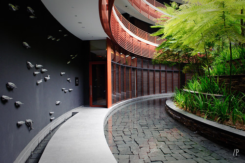
[Image: "The ghost cinema" by Phill Davison, used through Creative Commons].

An article posted today on New Scientist suggests that, over the course of a 150-minute film, audience members will miss an incredible fifteen minutes simply through the act of blinking – but also that people watching a film tend to blink at the same time.
It's called "synchronized blinking," and it means that "we subconsciously control the timing of blinks to make sure we don't miss anything important" – with the addendum that, "because we tend to watch films in a similar way, moviegoers often blink in unison." That is, they blink during "non-critical" moments of plot or action, creating a kind of perceptual cutting-room floor.
On the one hand, then, I'm curious if this means that clever editors, like something out of Fight Club, might be able to insert strange things into those predicted moments of cinematic calm – moments deemed safe for blinking – simply to see if anyone notices, but I'm also left wondering if there is an architectural equivalent to this: a spatial moment inside a building in which it seems safest for us to blink.
In other words, do people not blink when they first walk into a space like Rome's Pantheon or into Grand Central Station – or is that exactly when they do blink, as if visually marking for themselves a transition from exterior to interior?
It would seem, then, that if film has moments of synchronized blinking, then so might architecture – but when do we choose to blink when experiencing architectural space, and do those moments tend to occur for all of us at the same time?
How could we test this?

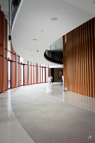
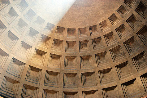
[Image: The Pantheon, photographed by Nicola Twilley].

Further, if there is, in fact, a moment inside a building somewhere where almost literally everyone blinks– say, in the lobby of the Museum of Modern Art, or in a bathroom corridor in the history building at your own university – could we say that that space is somehow yet to be fully seen?
It is the spatial equivalent of those fifteen minutes of a film that no one realized they missed.
After all, perhaps there's a detail in your own house that you've never actually seen before – and it's because you tend to blink as you walk past it. Your own body assumes, outside conscious awareness, that this must be a safe space for blinking; it's near a window, or the colors are very dull. Perhaps that's how spiderwebs build up: you literally don't see them.
On a much larger scale, meanwhile, are there stretches of highway somewhere outside town where the scenery gets a bit boring – and so everyone starts to blink, more or less at the same time, thus visually removing from collective cultural awareness that McDonald's, or that abandoned house, tucked away over there beside the trees?
And could you locate that exact moment of blindness – could you find blinkspots throughout the urban fabric – and start to build things there? Architecture becomes a three-dimensional test landscape for the neurology of blinking.

[Image: A human blink, via Wikipedia].

For instance, if people driving 65 mph travel, say, five feet with every blink, then what spatial and architectural possibilities exist within that five feet?
What are the spatial possibilities of the blink?
I'm reminded of certain zoning laws in which you need to consider the exact amount of shadow your building will cast on the neighborhood around it before beginning construction.
But what about zoning for blinks? Can you zone a building for maximum blinks?
Or perhaps the opposite: a new genre of architecture, specially designed for Halloween fun houses, in which it's too stressful to close your eyes even for a micro-second...

(Spotted via @jimrossignol).

Tuesday, July 28, 2009

Annals of Artifice

This project made me think specifically of the MOMA rooftop garden by Ken Smith... something about artifice that seems somewhat contrived... but I guess that's the point :) Via Treehugger: "Purists sneered at this garden made out of plasticine when it was first exhibited at the Chelsea Flower Show. Designed by the star of Top Gear, James May, it offended the sensibilities of the traditionalists who believe only real flowers and gardens belong in the show. But the last laugh is for car-loving May: not only did the "garden" win a gold (plasticine) medal at Chelsea, but it is now on display at a stately home in the English countryside, as part of the National Trust's "Food Glorious Food" campaign. What is going on here?"


:: images via Treehugger

Garden City Detroit

A great dialogue that happened a few weeks back over at Kaid Benfield's blog at NRDC (read it, the links, and the comments... good stuff) - about the fate and potential for Detroit. Seems that without reading the report - there's a lot of knee-jerk reaction to what has been percieved as 'bulldozing and planting sunflowers' as an urbanist theory. I posted a semi-long response with a wee bit of thought - and thought it a good idea to repost - as it's definitely a very important idea. The following mini-essay is the result.

Garden City Detroit: Landscape Urbanism in Action

"They paved paradise, to put in a 'lifestyle center'..." - adaptation from Joni Mitchell - 'Big Yellow Taxi'


The SDAT for the City of Detroit, was a good process and definitely began to coalesce into a vision - but was also a week long and should definitely not be construed as 'the solution' to what is a complex problem. I am going back to this topic often, as I was left with a permanent imprint from my short time there that is both innate fascination and specifically driven by the completely different nature of Detroit versus Portland in terms of urban evolution and issues.

One of the major points of conversation in the SDAT process was that people were (finally) beginning to acknowledge that the expansive and sprawling growth of the City of Detroit was not ever going rebound in terms of pure economics nor develop in the same way that created to initial urban form. And really this was way pre-recession - not a product of the recent downturn. People were relieved, as years of 'let's get the economy back and we'll be ok' mentality did little to create viable economic change nor good solutions for the City in general. This did acknowledge the urban flight problem, but set the only metric of success as full re-inhabitation, offering little in way of solutions.

Rather than provide a utopian 'garden' in the fabric of this shrinking city (thus my cringing at the analogy to 'english countryside' - the landscape provides a variable and adaptable field for a number of potential uses (to name a few: agriculture, open space, habitat, power generation, new industry, as well as vibrant good development) that were meant to become the next wave of urbanization. We were very specific in not taking any land 'off the table' for future development but rather looking at many empty acres that required infrastructure and upkeep. Agriculture is at best a productive use for land otherwise left fallow - at worst a temporary interim use for land until it is re-inhabited in, hopefully, a better way that takes advantage of good principles and gives people choice and options. If the size of Detroit in population rebounds - it still won't need the sizable urban footprint that it has - but the concentrations of population will provide dense centers. This is why 'urban growth boundaries' isn't appropriate - there's way too much land already.

I know this isn't 'urbanist' thinking but that's the point. The tenets of landscape urbanism, quoting Waldheim: "...describes a disciplinary realignment currently underway in which landscape replaces architecture as the basic building block of contemporary urbanism. For many, across a range of disciplines, landscape has become both the lens through which the contemporary city is represented and the medium through which it is constructed.”

It's changing the way we think of urbanism (especially for traditional planning theorists) and definitely is in need of more discussion, but it sure makes a lot of sense, particularly in Detroit and other shrinking cities. The key is not thinking of the land or buildings for that matter as binary - either development or landscape - but always in flux and in need of intervention and evolution. Sometimes this means protection of cultural and historical resources. Sometimes it means, for lack of a better term, a redo. This is the key to our future - getting out of the idea that one direction leads on a direct and singular path - but that it is constantly forking and twisting to what inevitably will be different and much more wonderful than any planning process, no matter how well thought out, can envision.

Tintinhull House

Tintinhull House is a beautiful house mostly known for its arts & crafts garden. Located in Somerset, England, the gardens surround a 17th century house which is built of the local stone, Ham stone. The house and property belonged to the Napper family until 1814 when it passed through the hands of numerous families before it was bought by Phyllis Reiss in 1933.

Phyllis designed the gardens in the Hidecote style and developed them before gifting them to the National Trust in 1955. She continued to live in the house, caring for the gardens, till her death in 1961. Since then the house has gone through a number of lucky residents. I suppose living in the middle of a tourist attraction wouldn't be so bad if it were so beautiful!
Plan your visit at the National Trust
More information from Wikipedia
Photo courtesy of an Australian friend who visited last month. Thanks! Look forward to some more of his beautiful photographs of English country houses!

Monday, July 27, 2009

Central Hub

If it works in Quito:

manair1.jpg
[Mariscal Sucre International Airport in Quito, Ecuador | image source]

Then why not in Manhattan?:

manair2.jpg
[Proposed Manhattan Airport by The Manhattan Airport Foundation | image source]

Oh wait, Mariscal doesn't work, which is why a new airport is being built 20km (12.4 miles) east of its current location, set to open in 2010. Nevertheless The Manhattan Airport Foundation is proposing the transformation of Central Park into an airport, a "viable and centrally-located international air transportation hub in New York City for the benefit of all New Yorkers."

Obviously this isn't a serious proposal, but the web page is presented in such a way -- particularly its assured and persuasive language -- that the project seems to mock proposals of this type, large (infrastructure) projects that purport to help people but have detrimental effects that offset the apparent benefits. Here the downsides are particularly obvious, with noise, fumes, heat, aircraft clearances, and the appearance of an airport in the middle of Manhattan being at the top of the list.

The answer to the FAQ, "I own an apartment alongside Central Park. What will Manhattan Airport do to my property value?" reveals the dry satire in the proposal, many notches down from The Onion. Statements that "these types of transformative public works projects have created an influx of interest and new investment in the neighborhoods in which they have been built" and that the area would "experience the economic 'trickle-down' effect these types of large scale redevelopment projects have precipitated time and time again" are clearly false, though they sound awfully persuasive here.

I'm not sure who's behind this fake proposal, or if it's worth the time and effort in creating the text and images, but I'm almost certain the combination of skilled writing, crude 3d images and professional-looking web page will fool many people in thinking the proposal is genuine.

(via Curbed)

The Phillips Collection

This past weekend I visited the Phillips Collection, a private museum here in Dupont Circle, DC which has an enviable collection of modern masters. Founded in 1921 by Duncan Phillips (a fellow Pittsburgher), the museum remains small but incredibly important. Works by Renoir (seen above), Paul Cezanne (also seen above) and Monet sit alongside very contemporary art. The museum was the first modern art museum in the United States which explains the incredible collection.I was drawn to the museum for the 'Paint made Flesh' exhibit which I highly recommend! Seen above is the new addition which houses the entrance. It quietly fits onto a small street, respecting the stately townhouses and embassies that are neighbors, just 3 blocks from the metro. Here you can see the original structure, a 1897 Georgian revival townhouse which was Duncan's home. After the deaths of his father & brother, Duncan and his mother dedicated the collection to their memory. In 1930 the collection was becoming so large that they moved out of the house and devoted it entirely to the museum.Above is a work by Paul Gaugin -I just love the colors and besides, the meal just looks delicious. At the top of the post is of course 'Luncheon of the boating party' by Pierre-Auguste Renoir(1880-1881) which Duncan purchased in 1923 -the museum's most well known painting to this day but surely not its finest.A painting by Chagall (my favorite artist).
The museum is known for its unusual approach to displaying the works. The collection is not shown in order by date or artist, but by similarities seen in the works themselves. This makes for a really enjoyable visit (as does the intimate scale of the space). I hope on your next visit to DC you visit the Phillips!

Sunday, July 26, 2009

Hoax of the Week


:: image via curbed

This one was pretty good and definitely had a bunch of folks going (via urbanism.org > via curbed)... The concept: "Bulldoze under Central Park and replace it with a modern, international airport. The idea is so simple, so beautifully elegant, so inevitable that it’s hard to believe we didn’t think of it ourselves. Rather, credit the shadowy figures behind The Manhattan Airport Foundation, who’ve worked up an incredibly detailed plan to turn Frederick Law Olmsted’s bucolic paradise into a postmodern universe of runways, terminals, and baggage claims. Good news for purists, too: per the Manhattan Airport FAQ, “Whenever possible, vestigial architectural elements of the Park space be retained or reworked into the context of the new design.”


:: images via curbed

Funny! Really f@ckin' funny... I do like the graphics though.

New Light on No Man's Land

Joyce van den Berg, a Dutch landscape architect, has some interesting plans to memorialize the thin strip of land that divided East and West Germany. From Spiegel Online: "The "death strip" or No Man's Land was the ground between the two Germanys. In the inner city the border consisted of an actual concrete wall, the one most commonly recognized as the Berlin Wall, but around the outer edges of the city the border was marked mainly by fences, watch towers and an empty strip of "No Man's Land." There are around 155 kilometers (96 miles) of the former border strip measuring between 20 meters and 2.5 kilometers in diameter."


:: image via Speigel Online

More: "Van den Berg, who carefully researched exactly where the former border used to be, also has some ideas for the man-made remnants at the former border. At one stage there were 302 watch towers on the border; today only five still exist. Van den Berg would like to see the five remaining towers, and any others that can be resurrected, turned into small, secret gardens. Unusual plants could be nurtured inside, protected from the wind and elements and onlookers wouldn't even realize the watch towers were there until they came closer, she says."


:: image via Speigel Online

The idea of restoration is essential to the scheme: "Her plan would see the barren strips of sand moved at regular intervals in order to encourage new plant life to take root as well as the ongoing formation of the "mega-dunes" that are already evolving naturally in the German woods."

Equally compelling are the graphics depicting some of this process landscape of revitalizing the sandy substrate.


:: images via Speigel Online

More: "Van den Berg also has a cunning scheme to mark the hidden escape tunnels that once led from east to west. These are considered some of the meaningful remnants of the former border area because if the tunnels, constructed at great risk to the tunnellers, were discovered it would often mean a shift in the border on the East German side, sometimes even the demolition of entire buildings or blocks. To mark where the tunnels were, van den Berg suggest beams of light be shone from the West toward the East, commemorating both the tunnels and all those who tried to use them."


:: images via Speigel Online

Radical Cartography

A very cool site that was reintroduced to me recently is Radical Cartography, one of the most interesting collections of maps out there (with the exception of maybe the wonderfully oddball collection over at Strange Maps). I had lost touch with the site, after this cool post on Agriculture maps of the US from back in 2008 - and now this won't happen again since they now have a blog that alerts readers to new content on the site.

It's not a secret that I heart maps, and anyone that offers a quote from Baudrillard for their explanatory page is tops in my book. Also check out the fully packed resources page for some great links. It's worth a perusal... here's a few teasers that I thought I'd share:


THE CARGO CHAIN
Bill Rankin, in collaboration with The Center for Urban Pedagogy, Labor Notes, The Longshore Workers’ Coalition, and Thumb Design, 2008


:: image via Radical Cartography

POTZDAMER PLATZ
from Artur Fürst, Das Weltreich der Technik (volume II), 1924.


:: image via Radical Cartography

LAND HISTOGRAMS

Bill Rankin, 2008


:: image via Radical Cartography

This is but a taste... and hours of enjoyment. Thanks Kelly R. for jogging my memory on this one!

A 35-year-old with vision and energy needed

The Chicago Tribune reports that Prairie Avenue Bookshop, "the best architectural bookshop in the world," may be closing its doors on the first of September if owners Wilbert and Marilyn Hasbrouck do not find a buyer. My friend Brandon tipped me off to this a few weeks ago, but I didn't want to believe it then, and it's hard to believe now. Even with Amazon.com's discounts I thought of Prairie Avenue as a mainstay, due to its deep catalog, used books and rare titles, items harder to come by and appreciate online. The Trib points out the 10.25% sales tax, "people [who] would come to the bookshop with their notepad, make notes of what they wanted and then go buy it somewhere else," and $650,000 in two lines of credit. Depressing, to say the least.

pabooks_RIP.jpg
[Outside Praire Avenue Bookshop at 418 S. Wabash | image source]

So if a new owner is found, one who is able to keep Prairie Avenue on its feet, how would that happen? By diversifying the selection, in effect moving it away from truly being a bookshop? From increasing its web presence, Wilbert's recommendation? Who knows, but this news does not bode well for other specialty bookstores, architecture or not. The writing on the wall is clear that books are a dying tool, pushed out by new technologies and a consumer base swept away by them. The death of bookstores is just one step in that unfortunate but eventual process.

Monday, Monday

My weekly page update:
image01sm.jpg
Southbrook Vineyards in Niagara-on-the-Lake, Ontario, Canada by Diamond+Schmitt Architects.

This week's book review is The Language of Things: Understanding the World of Desirable Objects by Deyan Sudjic.

Some unrelated links for your enjoyment:
Sincerely Sustainable
"Finding true sustainability in the marketplace." (added to sidebar under blogs::sustainability)

SustainableCoin
"The official blog of the Local AEC Network, a professional networking group focused on the fields of Architecture, Engineering & Construction." (added to sidebar under blogs::sustainability)

Design-Build Network
"An online portal and comprehensive industry resource [for] building business in architecture and construction." (added to sidebar under architectural links::professional)

design:related
"A community site and inspiration tool that brings together creative people from different disciplines (and parts) of the design world." The main page features feeds from various architecture, design and related blogs. (added to sidebar under blogs::aggregate)

KieranTimberlake ISO
Blog of the Philadelphia-based firm KieranTimberlake. (added to sidebar under blogs::offices)

Today's archidose #337


_TechL_48, originally uploaded by vtr do.

National Technical Library in Prague, Czech Republic by Projektil Architekti and Helika, 2009. The building officially opens to the public in the fall. Check out vtr do's flickr set from a recent site visit for many more photos of the building inside and out.

To contribute your Flickr images for consideration, just:

:: Join and add photos to the archidose pool, and/or
:: Tag your photos archidose

Saturday, July 25, 2009

Firm Faces #10: in situ DESIGN

Denver, Colorado's in situ DESIGN, featured on my weekly page back in 2006, use their studio space as the means for presenting each aspect of the firm, its projects, its awards, its press, and its people. All but the last are shown in windows overlaying the studio background, but the profiles of the individuals are revealed via a cartoonish interaction with each person at their desk.

FF010.gif

Unlike many "firm faces" which break people out of their space and routine for a group shot, in situ DESIGN's technique melds the studio and its individuals. It's an appealing way (minus the somewhat annoying but necessary scroll) of giving outsiders a view of where the work unfolds and who contributes to it.

Reinterpreting a Classic

Via Treehugger: "In 1982 Agnes Denes created one of the first examples of ecological art--she planted a wheatfield on an abandoned piece of land in downtown New York. Now, 27 years later, her work is being reinterpreted and updated, only this time in the east end of London. A derelict site has been planted with wheat uprooted from Lancashire and driven to Dalston for replanting. In addition, a solar windmill has been built to power two public ovens to make bread."

"Wheatfield - A Confrontation"
Agnes Denes - 1982 (more via greenmuseum.org)


:: image via Treehugger

"The Dalston Mill"
EXYZT - 2009 (part of the Radical Nature exhibition at the Barbican)


:: image via Treehugger

Soundtrack for Spaces?

A brief lull in posting due to a visit from family, and a kick-ass barbecue last weekend - which culminated in the inaugural usage of the new backyard fire pit. As an aside... this past Friday, we took a short half-day trip to a popular hiking spot in the Columbia River Gorge, with the route passing through the Historic Columbia River Highway. This scenic and windy route is a must-see both for the route itself, and for the multiple trailheads to waterfall hikes throughout the gorge.

So yes, soundtrack... as my passengers dozed on the slow road, I cued up the I-Pod with the fabulous Seattle band Fleet Foxes, which btw is fabulous driving music. As the road twisted, turned, slowed and sped up, and moved from light to dappled sun to dark - the music stayed sycopated perfectly... with lyrical and musical ebb and flow that seemed choreographed by some unseen hand.


:: image via Travel Oregon

:: image via Wild Nature Images

A video of the Fleet Foxes (if'n you don't know them) is below... and check out their tunes on their MySpace page.


Fleet Foxes


One thing that this made me think of what the idea of purposeful insertion of music into the idea of the narrative of the city, such as GPS-enabled smart phones and portable music devices that play particular rhythms or artists based on location, time, and activity - or better yet, are connected to traffic speed and the myriad ebbs and flows of city life. Perhaps an antidote to the obvious disconnect from reality that technological devices seem to elicit.

Directed back to Landscape Architecture, there are precedents in the idea of Halprin's RSVP Cycles and the conceptual framework of producing 'scores' of spaces.


:: image via google images

It also got me thinking about other sountracks to places both urban, wilderness, linear or static... such as my propensity to listen to Band of Horses while biking home from work, or the strange and short lived jogging to Elliott Smith. Anyone have the specific soundtrack to your urban life?

Friday, July 24, 2009

Today's archidose #336


, originally uploaded by AndrewRudolph.

Cube Tower in Guadalajara, Mexico by Estudio Carme Pinós, 2005. See the floor plan here.

To contribute your Flickr images for consideration, just:

:: Join and add photos to the archidose pool, and/or
:: Tag your photos archidose

Sketching

With Habitually Chic 's and my trip to Paris fast approaching, I've been thinking about what to pack. Naturally, as an architect, my sketchbook is one of the first things I thought of. Now, warning -I am not a gifted sketch artist, I'm obviously no PVE! Rather, it's a way for me to work out what I'm seeing and take time to concentrate on the details - whether it be ideas in my head, something I'm seeing in my travels or sometimes even an image from a magazine.
I've used these Rhodia pads for years now,the 6"x8" size: this is my actual sketchbook scanned in! I love the Rhodia pads because they have graph paper, I love a straight line and need all the help I can get! This one is not too banged up yet but wait till after Paris. I typically fill up one a year but I may need a new one just for this trip! So here is a little tour of some of the highlights in my current sketchbook.
A 'modified' poolhouse from the book Tiffany's palm beach.A party pavilion idea that I got from a recent party by Mary Mcdonald.travel sketchesan idea for a house sketched on the subwaya field survey with measurements
yet another house idea with quotes in my head that are jotted down at the bottom....A doorway in a house museum sketched quickly while I tried to walk along with the group!
a little seaside cottage ideaidealized sketch of garden & conservatory from a recent magazine.
Idea for a dressing room closet systemchair designs
House at the beach on Cape Cod last yearweird axonometric drawing of a neoclassical house - worms eye view I supposeplan of a NY penthouse apartment