Temporary lakes have sprung up all over Manhattan again this week, sometimes more than twenty feet wide and a foot deep, spanning curbs and pooling in gutters, the aquatic remains of last week's rain and snowmelt.
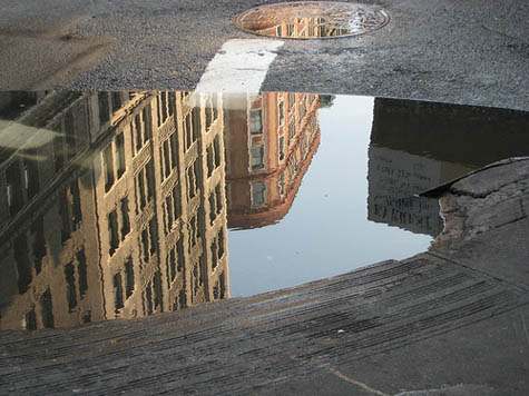 [Image: Photo by Flickr-user ShellyS].
This surprise
limnology—often demanding new, indirect lines of approach from one side of the street to the next—reminded me of David Gissen's recent, recommended book
Subnature, which includes an entire chapter on urban puddles.
"Although we often think of puddles as inconsequential," Gissen writes, "they appear in architectural history in prominent ways—in drawings of ruins, photographs of decaying buildings, and experimental designs that attempt to use water in provocative ways." Now, however, "these stagnant pools of water, once signifying society's vulnerabilities, appear to have disappeared in much contemporary work"; indeed, he adds, contemporary architects have seemingly always "viewed stagnant water with suspicion." There is good medical reason for this suspicion, of course; indeed, the Centers for Disease Control advised last year that "
neglected swimming pools"—i.e. stagnant bodies of water—are fast becoming vectors for mosquito-borne disease.
The CDC specifically cites "the adjustable rate mortgage and associated housing crises" as unexpected disease incubators: "Associated with home abandonment was the expanding number of neglected swimming pools, jacuzzis (hot tubs), and ornamental ponds. As chemicals deteriorated, invasive algal blooms created green swimming pools that were exploited rapidly by urban mosquitoes, thereby establishing a myriad of larval habitats within suburban neighborhoods," they wrote.
In any case, Gissen describes "visions of the undrainable city" as a kind of sickly counterpart to the modern, infrastructurally managed, rational metropolis, pointing out that "the waters inundating the modern city rained from above and surged from below." These overload our modern streets and sewers, bringing even 21st-century cities closer to the flooded Roman basements of Piranesi than to the hygienic visions of Le Corbusier, Gissen suggests. I'm reminded here of a disconcerting remark made by Alan Weisman in
The World Without Us that the subways of New York City would be irreparably flooded within only 36 hours if the city's underground pumps ceased to function.
While reading Gissen's chapter on puddles, however, one of the first things that came to mind is that someone should produce a puddle map of New York—an urban atlas of temporary flooding. Set your parameters—puddles one foot deep by thirty-feet wide, say, or, more accurately, a volumetric guideline (at least one hundred square-feet of water or no less than 120 gallons)—and bring these fleeting aqueous forms into the geographic consciousness of the city.
 [Image: A map of glacial Lake Agassiz].
From one rainy season to the next, an accelerated
paleolimnology of New York thus comes into being; the
Lake Lahontans and
Lake Agassizs of the five boroughs are given their cartographic due.
Here a tiny lake once stood, historical plaques could read, bringing to mind a liquid version of
Taylor Square, the famed "smallest park" in Cambridge, Massachusetts.
What monstrous puddles have existed in your neighborhood, and how have the urban circumstances of their existence changed over time? Did curb-cuts or new drains eliminate these hydro-geographies—or even make them worse? And whose lives have been affected by these unmapped bodies of water, whether through hydroplaning, sidewalk splashes, or even an expensive pair of ruined shoes?
Whole personal histories of human contact with puddles, and the effects such exposure might have, could be produced or recorded. This is extraordinary: we live beside temporary lakes and inland seas in cities all over the planet, yet these landmarks never make it onto our maps.
 The bright young thing mentality: the penchant for fantasy and masquerade had become an expression of the disregard they felt for the immediate past or the immediate future. They lived -or tried to live - outside their time. Philip Hoare, Serious Pleasures, the life of stephen tennant
 New Years Eve is the perfect time for fantasy. What do you want your life to be this coming year?
 Or fantasy could be as simple as dressing up in costume for the evening: full of high hopes for the future and escaping the past year.
 Fantasy is not dead, it survives.
 Whatever form your fantasies take or whatever you may wear, I hope you have great New Years celebrations!


 [Image: From
 [Images: From
 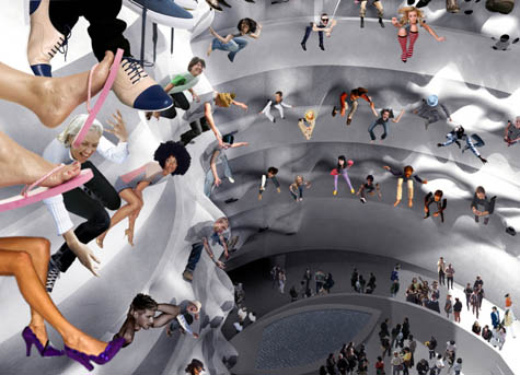 [Image: From
 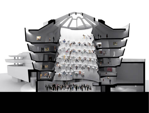 [Images: From
 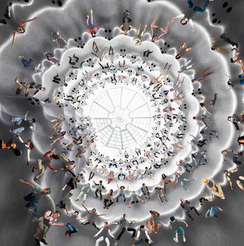 [Image: From
 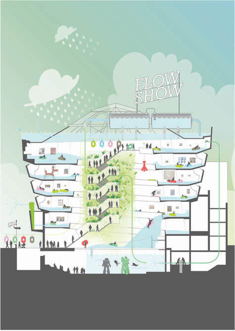 [Image: Flow Show by
 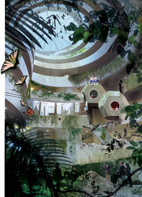 [Image: Untitled by
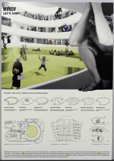
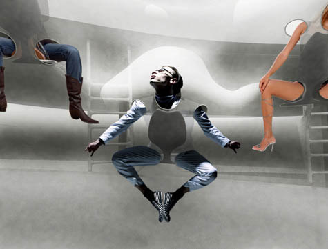
 [Images: (top) Let's Jump! by
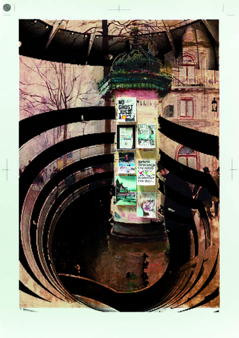
 [Images: (top) Morris in Guggenheim by
  [Image: State Fair Guggenheim by
  [Image: Untitled by
  [Image: A poster for
  Featured in the March 2008 issue of Metropolitan Home magazine was an example of a city apartment with great bones which was renovated efficiently and beautifully. The great bones were there, natural light, outdoor space and tall ceilings on a high floor.

 I would buy a rat filled shoebox of an apartment for that terrace. Amazing! I'm in love with the walnut paneling Povero had installed behind the fireplace (top image) and in the kitchen below and with the acres of white marble. I would have used a beefier countertop at the island though I think.....it looks fragile and skimpy.


 The sad news is that my old camera (2002 canon powershot sds) finally died yesterday and I'm in the market for a new one. The good news is that I get to take advantage of updated technologies, mainly size! My old camera was small for the time (basically pocketsize) and has performed really well, but as the years progressed smaller versions were being released. As I like to carry my camera around with me all the time, size is so important -it must fit in my pocket!
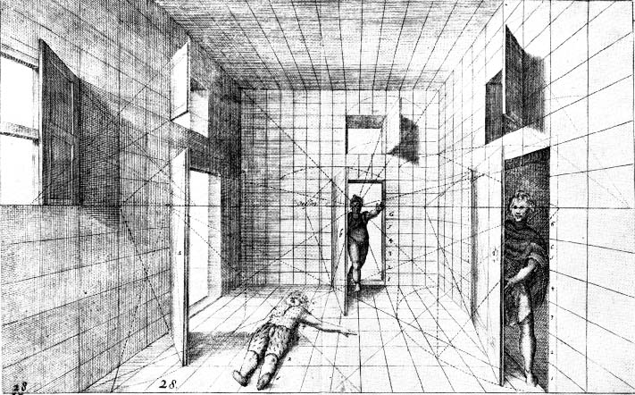 [Image: Perspective by


 The Villa Karma on Switzerland's Lake Geneva was his first major project, and here he was experimenting with what modernism was and yet still referencing the classical tradition more than in his later projects. It's this juxtoposition that I love so much and yet is so hard to find.
 Loos's life, by the way, was a veritable soap opera, that would shock the most liberal biographer today. His contemporary, Frank Lloyd Wright was a walk in the park comparitively! But I'm not here to talk about his life ( you can read about it on wikipedia
  Here you can see some of the classical Doric columns that are used here on a loggia, but also at the front entrance as seen in the top image. Their presence is striking against the slick and austere facade of stucco. Notice also the statue of a face to the left - a classical element.
 The upper level of this opening, as seen from the hallway above, was an obvious precedent for Michael Grave's own house in New Jersey (as was much of the work of Loos). Recognize it?
 The library again shows the decorative (but not ornamental) use of marble and wood with large windows overlooking the lake. I could spend all day in this room!
 This corner of the library shows another modern take on 'tradition' - a stained glass window.
 The most famous room in the house, however (which also appears on the cover) is the master bathroom. Classicism rears its head again, this time in a black marble. The bronze doors are studded and I wouldn't want to walk into them in the middle of the night! The sink is between the 2 doors seen below: this room is enormous - a veritable temple to cleanliness!
 The loggia, off the dining room is similar in form, but the floor pattern from the dining room is echoed on the ceiling out here in a classical motif. The niches at the end of the space are also somewhat classical (and I feel were probably added by Ehrlich and not Loos)
 The photographs are by Roberto Schezen from the marvelous book, Adolf Loos Architecture 1903-1932 by Kenneth Frampton and Joseph Rosa.