
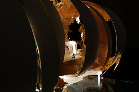
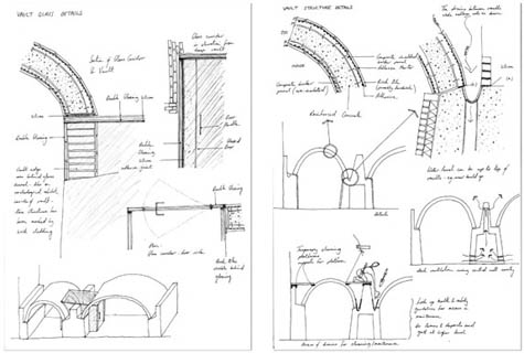
I'm especially taken by the image on the party invitation of the Aula de Cèdres, a conference center and auditorium at HEP Lausanne:

On Wednesday Gubler spoke of Tschumi's architecture relative to color (embraced by the architect, but rarely captured in documentation of buildings) and scale, referring to the book's subtitle and the architect's consideration of design from furniture to the city. The book offers an in-depth exploration of Tschumi's career, which includes a number of office headquarters, for Nestlé, La Mutuelle Vaudoise, and the World Health Organization. (This blog post at New Switzerland gives a decent overview of the qualities of Jean's architecture.)
One is tempted to break down how the father's architecture influenced Bernard Tschumi's, though if an influence on the latter is evident, it is in the year's since his father's passing. Some brief words on Wednesday by the architect of the new Acropolis Museum pointed to little discussion between the two regarding architecture. In fact Bernard admits that he didn't decide to pursue architecture until a trip to Chicago, only a few weeks before his father died. But with time to study his father's buildings, and a role in Architecture at Full Scale, it would be difficult not to find Jean's influence on his son.

[new Acropolis Museum | image source]
Looking at the two buildings shown above, I would say the influence of Jean on Bernard happens primarily with thinking about site. The above clearly illustrates how the new Acropolis Museum's top relates to the distant Parthenon, while the lower floor contends with the ruins preserved below. In between, the museum is all about movement and the clarity of the exhibition, but it can be seen as the byproduct of contending with the site below and distant. The elder Tschumi's HEP building skillfully addresses the site's topography (as can be seen here) and adjacent buildings, standing out formally but fitting into the multi-faceted landscape.

In the Wednesday-night party's introduction by Nina Rappaport, Chair of DOCOMOMO-New York/Tristate, the preservation of Jean Tschumi's architecture in Switzerland was commended, an unspoken difference between an appreciation of Modernism's gems and the demolition of the same in part or in full an ocean away. The US chapter of DOCOMOMO (international working party for DOcumentation and COnservation of building sites and neighborhoods of the MOdern MOvement) includes ten regional chapters (all tolled the international DOCOMOMO is 53 chapters strong), but fights for preservation seem to be lost more often than won.
While this fact points to a limited appreciation in this country for architecture produced in the middle of last century, I can't help but wonder if this situation is more about ideology than taste. Modernism was predicated on progress and responses to the changes sweeping across the developed world from industrialization and world wars, so the preservation of the movement's buildings seems anithetical to their origin. That people equate modern architecture with the tabula rasa clearing of neighborhoods, towards the erection of towers in the park in that time does not help matters.
A couple issues further complicate matters: how many modern buildings were not built with the longevity of buildings centuries before; the open plans and platonic forms of modernism did not turn out to be as flexible as envisioned. These point to the necessity of preservation less than 75 years after many buildings of the era were completed and the creativity needed by architects to propose and carry out the adaptive reuse of modernist structures. I think the latter is key in efforts to preserve modern architecture, especially when faced with opponents arguing that demolition and new construction is cheaper and therefore better. The fact that many modern buildings are ingrained and important elements in their neighborhoods (ironically, like the older buildings many modern structures replaced) is perhaps the strongest argument for DOCOMOMO's continued relevance today.
 [Image: "Moravian Mount" from
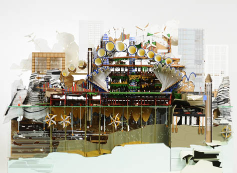
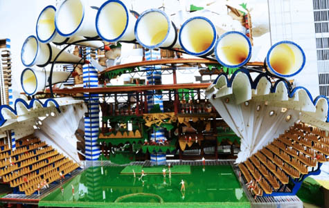
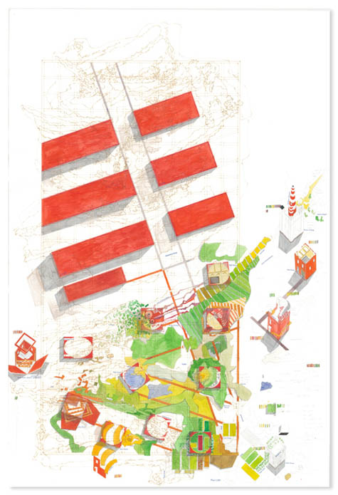
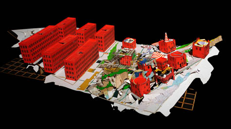
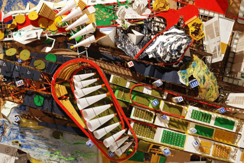 [Images: From
 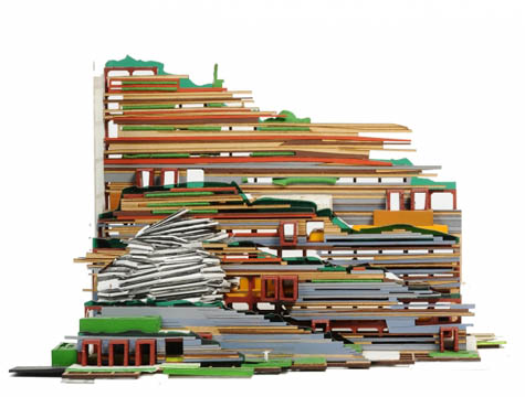 [Image: From
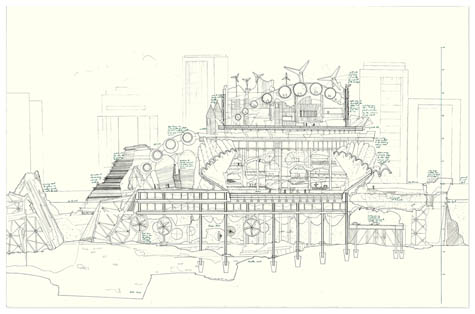
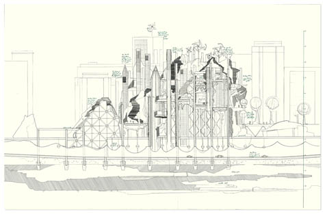 [Images: From
 [Images: "House of Drink," "Greenhouse," and town plan from
 [Image: From
 [Images: From
 [Images: From
 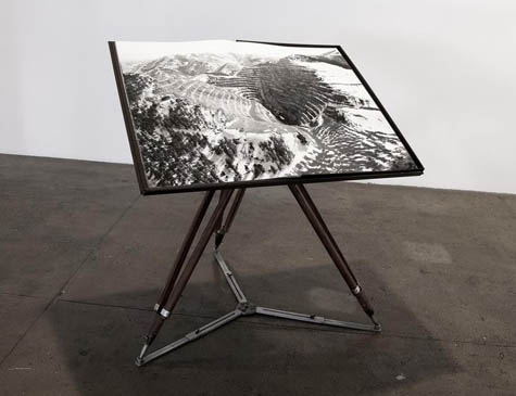 [Image: Michael Light, Bingham Pit photograph mounted and on display].
 [Image: Two photos from
  [Image: Michael Light, "Garfield Stack, Oquirrh Mountains and Ancient Beach of Great Salt Lake" (2006)].

 The historic hotel has been beautifully renovated but updated with modern furnishings and light fixtures that are easily reversable so no fears of the space 'dating'.
 They have some creative cocktails and probably the best sangria I've ever had (the fruit is strained out so you don't get those nasty bits in your teeth!)
 But it's the atmosphere that truly gets me, especially at night. Ebony paneling, an antique ceiling and tall windows.
 We had our local dc design bloggers happy hour here a few weeks ago and now I'm hooked! If you're ever in dc check out the hotel!

 [Image: "Oops" by
  [Image: From Rem Koolhaas's unbuilt proposal for the Parc de la Villette in Paris, via
  [Image: From a project by


 Michael quickly broke down his design philosphy in a very clever way and you can see examples of this throughout all his work: the mixture of 2 ideas (often opposing) that bring out the best features of both. Whether it be mostly modern with an antique painting thrown in or English country with a few pieces from Marrakesh, this tension is where the interest lies in his work- the true definition of an eclectic interior! He believes the discord "brings you into the moment by its contrast".
  At the same time, Michael is concerned with balance. He never wants a room to be 'too simple, too fancy, too cluttered', etc. In a very formal dining room he'll throw in a sisal rug in contrast to a patterned or scenic wallpaper.
 Michael said that being an interior designer is one of the most personal and private fields you can ever go into. You get to know your clients very intimately and you should never betray their trust, hence the 'don't ask don't tell' policy on the White House! He did however mention that his work there was to 'highlight the best of America' and not neccesarily the traditions of the White House.

