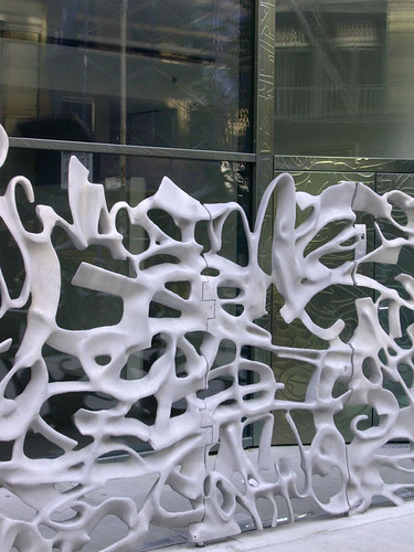
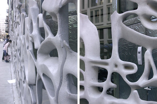
When I say "function of graffiti," what I mean is the purpose of the curvy, cast-aluminum screens/gates that demarcate public from private, sidewalk from townhouse, us from them, the screens whose patterns were "derived from contemporary graffiti tags, hybridized by computer."

These screens veer strongly from the simple curved-glass profiles that cover the concrete frame above. While the textured metal walls tucked behind these screens strive to balance these two architectural statements, the graffiti design is so strong in its own right to make that balance next to impossible. But why is such as strong artistic statement made with the ground-floor screen?

[Note the gate "cut" into the graffiti.]
My answer to that question is "to improve the relatively undesirable location of living at sidewalk level in Manhattan." Sure, New York has plenty of "life on the street," but most people don't want that life in their apartment, much less right out in front of it. One need only walk about the island to try and even find an apartment so vertically tight with the sidewalk to see what people want. It's simple to find units a half level above or below this level, but it is very hard to discover something like this, where a wheelchair -- though in more likelihood a stroller -- can roll into the apartment.

When I did come across a ca. 1960-70s building in a similar vein to 40 Bond, the prison bar-like gate was so unfriendly that the prospect of living behind it seemed, well, like being a prisoner behind bars, or like an animal in a zoo. So when the Swiss duo of Jacques Herzog and Pierre de Meuron were faced with making these units desirable, or even tolerable enough for their asking prices, they went all out and created something as far removed from prison bars as possible. (One interpretation might see the screen as resembling bones, and equate their roles as structure and barrier as a parallel to prison bars.)

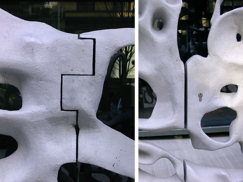
[Hinge side left; lock side right]
To me the most interesting moments of the screens that cover most of the street level elevation (minus the main entry) are where the functional gates occur. Given that the townhouses stretch the full depth of the building, entry from the sidewalk is necessary. The in-and-out and straight cuts of the hinge and lock sides respectively indicate these openings were either an afterthought or not worth influencing the design. I'm guessing that a sense of entry was not desired, as the owner knows where the entry is and others should not, lest they try to gain access.
No comments:
Post a Comment