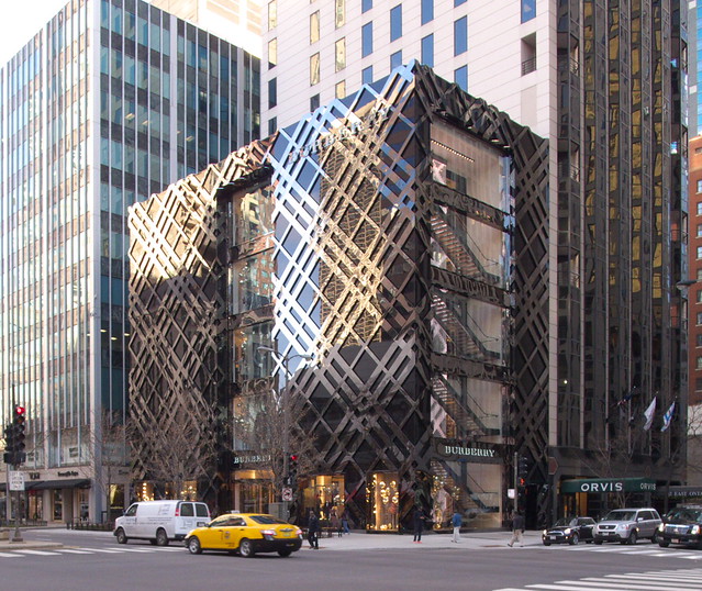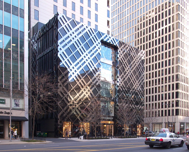
If you know Burberry (and, who doesn't?), then the building is instantly recognizable as their store. Basically the exterior is Burberry's signature tartan (below) enlarged to the size of a five-story building, turned 45 degrees, and rendered in reflective chrome on a black background. Kent, mistakenly in my opinion, calls the building a "decorated shed," referring to the famous polemic in Learning from Las Vegas. The building actually confuses the distinction between the shed and the "duck," but I'd say it leans closer to the duck. The tartan facade, after all, is an architectural expression, not a sign applied to a blank box. The shed is more accurately depicted in the Apple store up the street, which cuts the company's logo into the facade. Burberry's building isn't a Longaberger, but it's not too far off.

[Burberry tartan | image source]
Does it really matter if Burberry's store is a shed or a duck? It does if we judge the building as architecture rather than as signage. By angling the tartan 45 degrees, the in-house architects (with Callison Barteluce) are being playful with the pattern. But when I look at the tartan (above) I see so much more than an alternating rhythm of three wide stripes and one narrow band. I see things happening when these lines overlap; the stripes darken and change color, implying depth and a layering of lines. But what is the result on Michigan Avenue? Chrome stripes of equal value against a black background; absolutely no layering is evident on the facade. Further, the windows are orthogonal to the box, cutting against the diagonal stripes as if they are merely surface appliqué.

Lynn Becker compares the new Burberry store to Herzog and de Meuron's Prada store in Tokyo, placing the former in a lineage of the "luxury retail flagship wars that have, until now, passed the city by." What this comparison reveals to me is the disconnect between inside and outside that happens at Burberry. The diamond pattern does not disappear upon going inside Prada, but Burberry opted for a black box interior whose majority is divorced from the exterior. This aligns it with the malls that litter North Michigan Avenue, their windowless bases serving the retail tenants rather than passersby.

[Dior Ginza, Tokyo, Office of Kumiko Inui | image source]
The windows cut into the exterior are easily the design's best parts, even as they are troubling. They visually link inside and outside; they accentuate vertical movement across its five stories (elevation facing Ontario, visible in top photo); and likewise they promote the stairs as an active means of moving up and down floors through a prominent placement that gives shoppers views down Michigan Avenue. So this makes me wonder, why don't the windows and tartan pattern coincide, à la Toyo Ito's design for Tod's Omotesando? Why not use architecture itself to express a brand (if one must) rather than having the pattern trump architectural creativity? Kumiko Inui's Dior Ginza hints at the potential that happens when a fashion house entrusts an architect to be creative with pattern, material, and transparency.
No comments:
Post a Comment