The main theme of the project is a folded Z-shaped pedestrian spine that traverses a significant grade change between the upper portion of the park/urban interface and the lower portion of the park/waterfront interface - also spanning the riverfront roadway below - connecting the park seamlessly from Elliot Bay to adjacent Belltown. This is shown below in a simplistic 'model' of interlocking planes:

:: image via Weiss/Manfredi
This theme provides interesting details, as well as a design parti that permeates both the site, landscape detailing, as well as the architectural forms. The buildings are appropriately designed, but in true Landscape Urbanism fashion, take their forms from the surrounding landscape fabric, not dominating or directing landscape spaces.

:: images via Weiss/Manfredi
I had the chance to visit the park about a year after it was completed, and the following photographs are from this trip. I took note of the specific landscape/built-form interactions, and some of the detailing that bridges and smooths these transitions. (all following photos by author)

:: Waterfront Pathway

:: Wall detailing
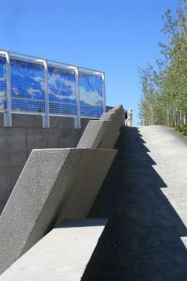
The clash of sharp angles provides some dynamism, as well as some particularly difficult details. The following photos illuminate the successes, particularly my favorite space in the park, the slightly offset angular convergence of sloped concrete walls above the roadway.

:: Roadway convergence

:: sloping pathways and spatial merging
As has been mentioned elsewhere, the parks success is less about the art it contains and more about it's contribution to the urban fabric. Thus the art-container transcends the art. In contrast with say, the Walker Art Center in Minneapolis, where the grounds provide a simple field for art placement, here the dynamic space often overshadows some of the lesser art pieces. While the collections will ultimately evolve, this follows other precedents in architecture where the museum becomes better known as a piece of architectural art, rather than as a functional space.
There are a few art-elements of note, in addition to the photogenic and iconic red form of the 'Eagle' by Alexander Calder. The first is shown below, not a consistent favority, but one i liked, is a sun-shade and canopy aptly titled 'Seattle Cloud Cover' by artist Teresita Fernandez, which plays with abstract colors and textures, as a piece in itself, as well as throwing interesting patterns on the ground plane:

:: Seattle Cloud Cover - by artist Teresita Fernandez
A consistent favorite is 'Wake' by Richard Serra, consisting of multiple forms of rusted steel forms evocative of ships and waterforms, tying the installation into the local context. Built as an interactive piece, it evolves based on the viewers point-of-view, although exists with a 'no-touching' policy which is strictly enforced, leaving some of this interactivity unrealized.

:: Wake - by Richard Serra
While primarily an urban park, there are some special moves that allow for pockets of refuge and immersion in nature along the pathways. The Grove, which naturally zig-zags up a hillside triangle, offers a dense planting of aspens along with site-specific artworks spaces along the pathway. This is a counterpoint to the dynamic rigidity to the adjacent areas.

:: a view of the grove - immersion in urban nature
The overal zig-zag concept makes for some stunning detailing, but allows for some difficult spots, particularly where there is a convergence of very sharp acute angles, which either create clunky merging of materials and lines, or allow for pedestrian crossing that degrades vegetation. The uppermost photo shows the difficult merging - and the lower shows the temporary fencing to avoid cross-cutting at waterfront level until vegetation is established.


:: Tapered crossing zones with depleted vegetation
In spite of these minor issues, the OSP is impressive - even more so in person than in the photos here or elsewhere. The combination of setting and strong design concept is powerful and seems to fit the Seattle aesthetic well. The softening of spaces that provide some counterpoint to the overall plan are successful, including adjacent fields of native groundcovers and other low-maintenance materials. The wall and pathway detailing, with a few exceptions, is impeccable, using relatively simple forms but making them vibrant by using them in subtle ways.
For additional information, here is a link to some interactive media about the OSP. Definitely check out the park flora link, as well as the construction slideshows showing in-process photos of various design elements.
No comments:
Post a Comment