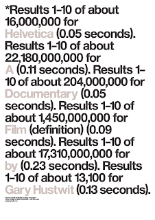
HELVETICA
As a self-described font nerd, the first documentary Helvetica did not disappoint. Spanning the history of Neue Haas Grotesk, it's original name, over the past 50 years of use and misuse. Love it or hate it, Helvetica is a ubiquitous font - and the reactions from graphic design icons to new cutting edge firms are fascinating. Non-font lovers will be bored after 20 minutes, whereas anyone who has sifted/adjusted/fretted over the typeface and/or kerning to get it just, oh, so right - will be mesmerized. While i've never been a fan of Helvetica itself, I walked away with a new-found appreciation for the typeface and it's longevity.

:: image via Helvetica website
A number of designers were interviewed, and subtle camera shots of Helvetica in it's native habitat were used to showcase the commonality and flexibility of this typeface. In addition to commentary from anti-Helveticans David Carson and Eric Spiekermann, most notable for me was the interview with Michael C. Place of the London-based Build and his creative use of Helvetica in a number of forms. Also check out their site for a fascinating exhibition '50', focused on celebrating of 50 years of Helvetica.

:: poster image by Build via Helvetica website
The feeling that I was left with immediately after viewing, was a duality of love/hate for Helvetica (the font, not the film). The best description I can paraphrase from the film was that 'helvetica has not innate connotation in it's own, and thus is an inert material for the designer to use in creative ways.' While this concept of genericism seems simple, most designs, including type, have ingrained cultural meanings that can positively or negatively impact the overall design concept.
MANUFACTURED LANDSCAPES
Second, the biopic documentary on photographer Edward Burtynsky titled Manufactured Landscapes was just made available via DVD from Netflix. I've been waiting for this one after missing it's brief run in town and hearing feedback from some folks that have seen it. The filming and photography was stunning, and the opening shot is worth the entire price of admission just for it's scale and monotony, but glimpse of humanity. Slow at times, it's definitely a pace that reinforces a certain mood - something you aren't riveted to but seems difficult to avert your eyes.

This was my first experience with the photography of Burtynsky. While I found the photos of China amazing, I was much more drawn to his photos of degraded, seemingly non-industrial landscapes, including photos of various mines and quarries. The impact of these images, in terms of nature and culture; beauty and blight - highlights the dichotomy of building and consuming, and the residual impacts that persist.
Kennecott Copper Mine No. 22 -Bingham Valley, Utah 1983

Nickel Tailings No. 34,Sudbury, Ontario 1996

:: Both images via Edward Burtynsky Photographic Works
Burtynsky's artist statment reinforces the idea of a consistent metaphor that can be derived from these images. The following excerpt from his website, reinforces the concept of seemingly ugly nature, rendered beautifully. This explains and magnifies how this is referential to our global society as a whole:
"Nature transformed through industry is a predominant theme in my work. I set course to intersect with a contemporary view of the great ages of man; from stone, to minerals, oil, transportation, silicon, and so on. To make these ideas visible I search for subjects that are rich in detail and scale yet open in their meaning. Recycling yards, mine tailings, quarries and refineries are all places that are outside of our normal experience, yet we partake of their output on a daily basis".
The film was well composed, with many long cuts of the process and landscapes. One of the scenes was particularly illuminating... While attempting to gain access to a degraded landscape of coal yards that supplies a majority of China's industrial growth, company officers are reluctant, repeatedly mentioning that that these would not make very 'pretty pictures'. Burtynsky's assistant shows them photographs of some of his other work and mentions 'that with his camera, he can make them beautiful.' The stunning image of coal piles extending into the horizon follows this exchange:
Tanggu Port,Tianjin, 2005

:: Image via Edward Burtynsky Photographic Works
The DVD definitely requires multiple viewings, and the additional bonus materials are well done and offer glimpses of Burtynsky's more expansive body of work. Not one to purchase films for rewatching, I plan on owning both of these and watching them repeatedly.
Both films focus on the man-made landscape, albeit in significantly difference media and scales. Helvetica examines something infinitely smaller-scale and constructed, a typeface, and it's larger impact on the overall landscape (of print, signage, and design). It has relevance to the day to day, and significant in the larger sphere of design. Much like a degraded piece of earth, it can also capture the mundane and ugly - along with the beautiful, which ties it in nicely with the central theme of Manufactured Landscapes. Small-scale or large, our creations, good or bad, mundane or significant, all speak of ourselves as much as they do themselves. Items which exist, and thus become part of the landscape, have the ability to tell myriad stories about us as individuals - such as the font you choose to use, and society as a whole - as in the degradation you can live with and perpetuate.
No comments:
Post a Comment